9 Tips for Making Websites Dyslexia-Friendly
How to make fonts, colors, and more create an inclusive online space
Did you know that dyslexia affects 20% of the US population, representing 80-90% of all those with learning disabilities? This is according to the Yale Center for Dyslexia and Creativity. That’s a sizable community of potential visitors to your website! And here’s the kicker – by making some thoughtful tweaks to your website’s design, you’re not just opening doors for them, but you’re also broadening your audience and creating opportunities. Sounds awesome, right?
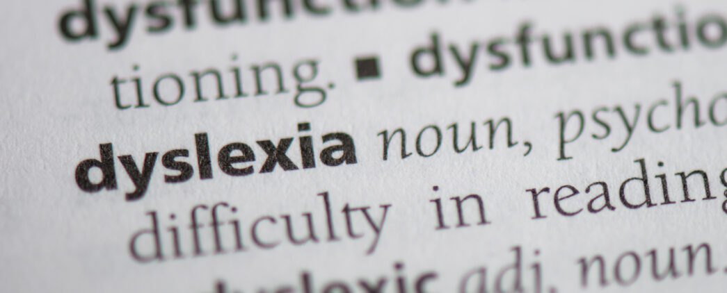
To start, what is dyslexia? It’s a learning challenge that makes reading a bit tricky. One way to think of it is a barrier in processing words and spelling. The good news is that with a few design enhancements, you can make your content significantly more accessible and inclusive.
Now, let’s discuss some user-friendly design advice for our friends who are dyslexics:
1. Fonts and Typography That Are Accessible:
- Select simple typefaces: Arial, Verdana, or Comic Sans (yes, that Comic Sans) are your new best friends.
- Use a comfortable font size (about 12-14 points).
- For emphasis, skip italics and use bold or underline.
- Reading in lowercase is easier than in all caps.
- Increase line spacing a little for easier reading.
- Choose fonts with a variety of letter forms and thicker lines.
- Discover more best practices on accessible fonts.
2. Formatting Text Making It Easier to Read:
- Condense long paragraphs.
- Use subheadings to assist readers.
- Numerical lists and bullet points? Yes, please!
- Maintain good paragraph spacing.
3. Perfectly Populating Colors:
- Strive for high contrast, but do not go overboard. Think dark text on light backgrounds rather than pure black on white.
- Use color thoughtfully, and include text explanations whenever possible.
- Bright, neon colors can cause vibration issues for low-vision users.
- Remember color blindness as well.
- Learn how to craft a contrast checker for your website and other digital assets.
4. Multimedia That Speaks Loudly:
- Videos and images can be very beneficial.
- Always include captions or transcripts for audio and video.
- Be sure to use clear image alt text.
- For even more knowledge, go to All About Alt Text.
5. Keep Your Words Simple and Sweet:
- Stay clear of jargon. Plain language reigns supreme.
- Be clear and succinct.
- Organize info with bullet points and headers.
- Simplicity and clarity are key for superior comprehension.
6. Your Website Should Be Easy to Navigate:
- Maintain a clear and consistent layout.
- Make hyperlinks descriptive (no more “click here” mystery links).
- Include a search function for quick finds.
7. Change It Up with Images and Diagrams:
- Incorporate visuals such as charts or illustrations.
- Keep in mind alt text and color-friendly schemes.
- Summarize complex graphics with text explanations.
8. What Helps One Group Often Benefits Many:
- “With videos additions that benefit dyslexic viewers work well for all viewers. Limited on-screen text, simple typography, single-line captions and clear visuals with attention to space are necessary for dyslexic users but benefit everyone. We try to adhere to communication best practices on every video.” – Tom, Digital Designer
9. Remember That One Size Doesn’t Fit All:
- Dyslexia varies from person to person. Chat with those who experience it to learn what works best.
- Dyslexic-friendly designs are helpful, but they’re not a panacea.
So, there you have it! With a few tweaks here and there, your site becomes a welcoming space for everyone.
Up Next
Thoughts
Updated Accessibility Rules From the DOJ and HHS