Graphic Elements & Digital Accessibility
Optimize design for screen readers, reach more users

As I began my typical morning at work, I came across a question on our Slack platform regarding graphic elements and digital accessibility. This project involved discussions regarding proper guidelines displaying graphics such as charts and images on a webpage. In this particular example, once the user selects an option to explore, further information regarding this item is displayed. As an individual who relies on screen reader navigation, I found this discussion very intriguing. I decided to conduct further research to write a blog post regarding graphics and accessibility on web pages in an attempt to educate the developers from the point of view of a daily user.
Inserting Alternative (Alt) Text on Images
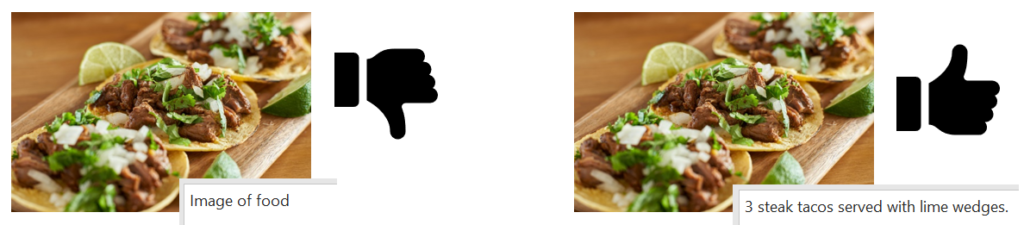
When companies insert images to grab the attention of their audience or to display information in a visual manner, the best way to make the experience accessible for all is to add alternative text. Imagine scrolling through a website and the screen reader saying, “image” or “graphic”. The experience is much smoother for everyone when alt text is added and the screen reader can provide context such as “Company Logo”, “a person reading on a laptop” or “an employee working on a laptop”. Alt Text should be kept to around 125 characters or less. This is because most screen readers cut off reading after 125 characters or more.
If the image contains a longer block of text or a chart, the alt text can be displayed as expanded or collapsed. For example, the user can press enter on the graphic to expand and read the descriptive chart information. In addition, screen readers such as JAWS (Job Access With Speech), have keystrokes that the user can trigger to read graphic contents. This is typically announced by the screen reader when the user comes across an image. The alt text can be embedded into the graphic to result in any of these actions through the long descriptions attribute, keystrokes pointing to the destination of the description, or embedding into JAWS descriptive text.
Sliders & Lists
Often, web pages contain sliders or lists where the user can select an item from the list to expand more information. I have experienced many sliders where pressing enter or opening the list through screen reader keystrokes does nothing to a screen reader. The user has to click on the slider through the mouse to read its contents.
Combo boxes are much easier to navigate with a screen reader than visually designed sliders. Provoking the correct keystrokes results in the list being available for the user to expand or collapse as expected.
Radio Boxes or Check Boxes
If a developer runs into a similar issue where they have a design that results in further information about a specific item when selected, radio buttons can also be useful. The user can press space on the radio button and the further information can expand below. Check boxes are also similar. When a user checks a particular item, further information about the checked item expands as text typically prompted by a space or enter.
Summing Up
Access to information both visually and by text is critical to reach the many different types of learners out there. The problem is that many web design companies don’t have the resources or the knowledge to promote digital accessibility to a large variety of audiences. This makes it difficult for users with screen reading technologies to access crucial information that is often needed for effective decision-making. For example, a user using a screen reader attempting to sign up for a retirement or a stock account is limited when they can’t access the information displayed in the chart regarding stocks and bonds independently. The article,”Human Rights and Information,” highlights the need for greater accessibility in various areas and emphasizes the significance of human rights in providing equal access to information for all. When websites are designed with accessibility in mind from the ground up, access and inclusion for all audience members is greater. This is why I have provided some options such as graphic descriptions and alt text in addition to proper use of lists and sliders as well as radio boxes or check boxes to increase accessibility.
As I have written this from the point of view of someone who uses a screen reader on a daily basis, I have provided additional resources that explain the methods of graphic elements and accessibility in much more technical terms. At Tamman, we are committed to accessibility from the start. If you have digital products or ADA compliance needs, we can also work with you to make your websites accessible to all audiences and increase inclusion.
Additional Resources
___
Nimit Kaur has been working with Tamman since 2019 where she has been a usability testing intern and contributor to external thought leadership. Nimit’s lived experience as a blind woman provides invaluable perspective to the Tamman community.
Up Next
Thoughts
Looking Back as We Look Forward