Tamman’s Pride
How we created a Pride Month logo to support our colleagues
At Tamman, we are consciously and intentionally human-centered. This commitment to inclusiveness means that from our internal policies to our software engineering, we focus on how people will use the thing or consider how this thing will affect a person. We want our colleagues to grow and develop over their time with us. We strive to create an environment where people are invested in, and where their careers are shaped. This explicit community building effort requires tending to on a daily basis.
Tamman invests in everyone. We never say no to professional development opportunities. It may not be an immediate yes, but it’s the start of a conversation. Individual development is not a request to be approved or denied and then forgotten. Rather it is something to be nurtured and shared within our team. This is how organizations support team members who build and leave legacies.
In our demos, lunch n’ learns, team presentations, study groups, and especially our annual retreat, we are always trying to evolve. Improving this process means looking to add in elements of sharing and communication across formal and informal learning every day. And to be clear, these efforts originate from the individual. No matter the form that professional development takes at Tamman – the structure or platform – it is the individual initiative that matters most.
Tending to a culture of learning, growth, and sharing is a constant effort. It requires leadership to set up and maintain, but without the colleague to learn, share, challenge, study, try, fail, and try again, it would lack any real gravitas or purpose.
Pride at Tamman
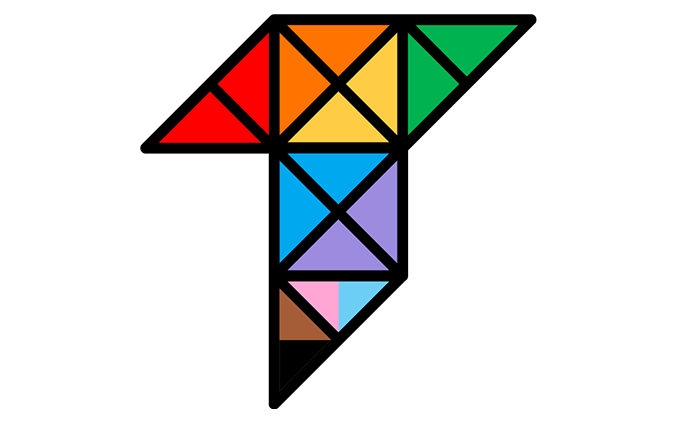
I was working late one night on some administrative work when out of nowhere I received a slack message with a couple of images. It was from my colleague, Hunter, one of our very gifted digital designers who specializes in motion graphics and video. He had iterated our relatively staid brand logo with the colors of a social justice pride flag.

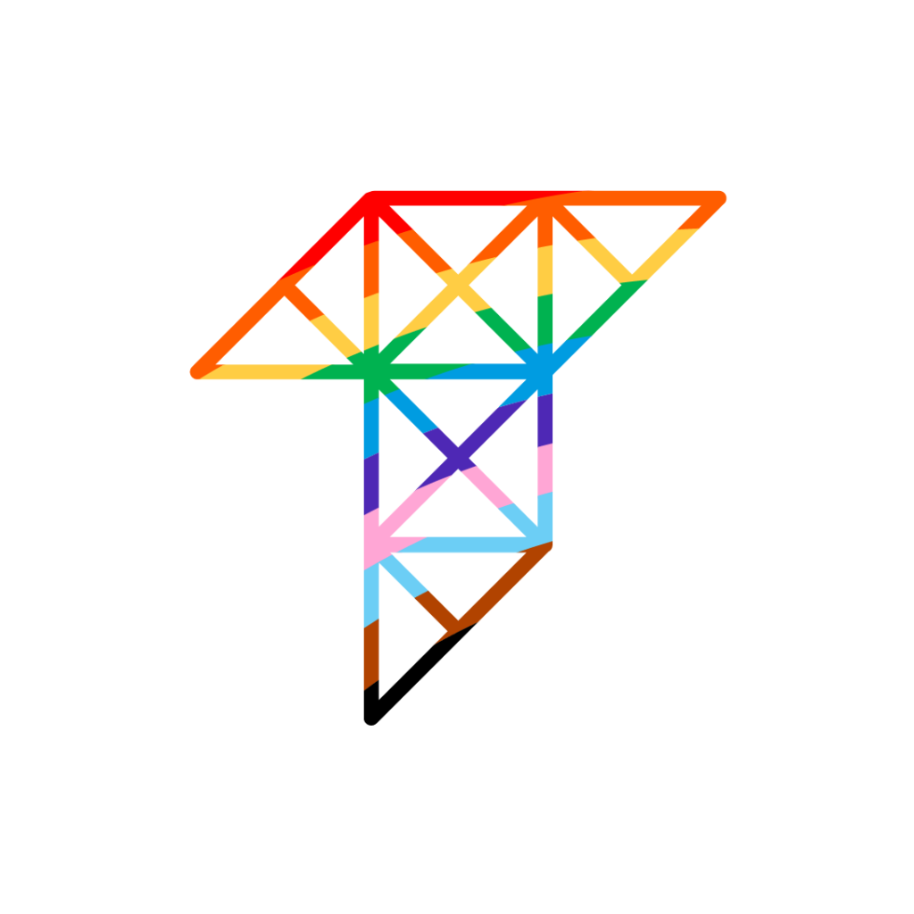
My first reaction was one of absolute appreciation. These logos and Hunter’s effort were genuinely awesome. This was followed almost immediately by the fact that I was pretty sure that these would not pass a graphical color contrast assessment which should be at the 3:1 ratio. This is for non-text graphical elements, like graphs, and as you will see given our final logo, we felt this was important. Tamman’s mission of accessing information and digital accessibility first means that we wouldn’t put anything out in the world purposefully knowing it wasn’t accessible for someone. I shared this information with Hunter – thanking him profusely, knowing that the thoughtfulness and effort was impressive, especially to do this on his own and after hours, but color contrast and accessibility is real, and we had to adhere to that.
I went back to my work and expected him to sign off. After all, it was getting late. Nope. I received this image next.
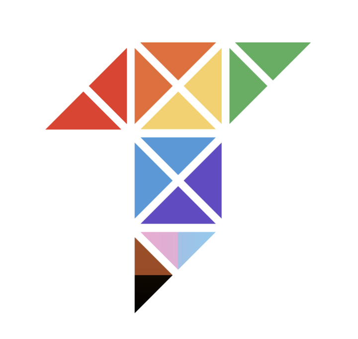
Loved it. It still had contrast issues.
He was undeterred. This effort was personal to Hunter, and he would not be denied. His next effort was right on point.
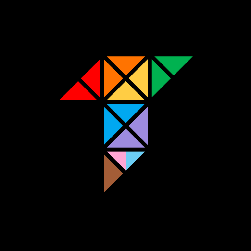
No issues with color contrast when the background is all black, but that wasn’t quite the aesthetic he wanted. Now having solved the accessibility aspects, he wanted to keep pushing the boundaries of his design. After a couple of more tries, here’s where he landed.
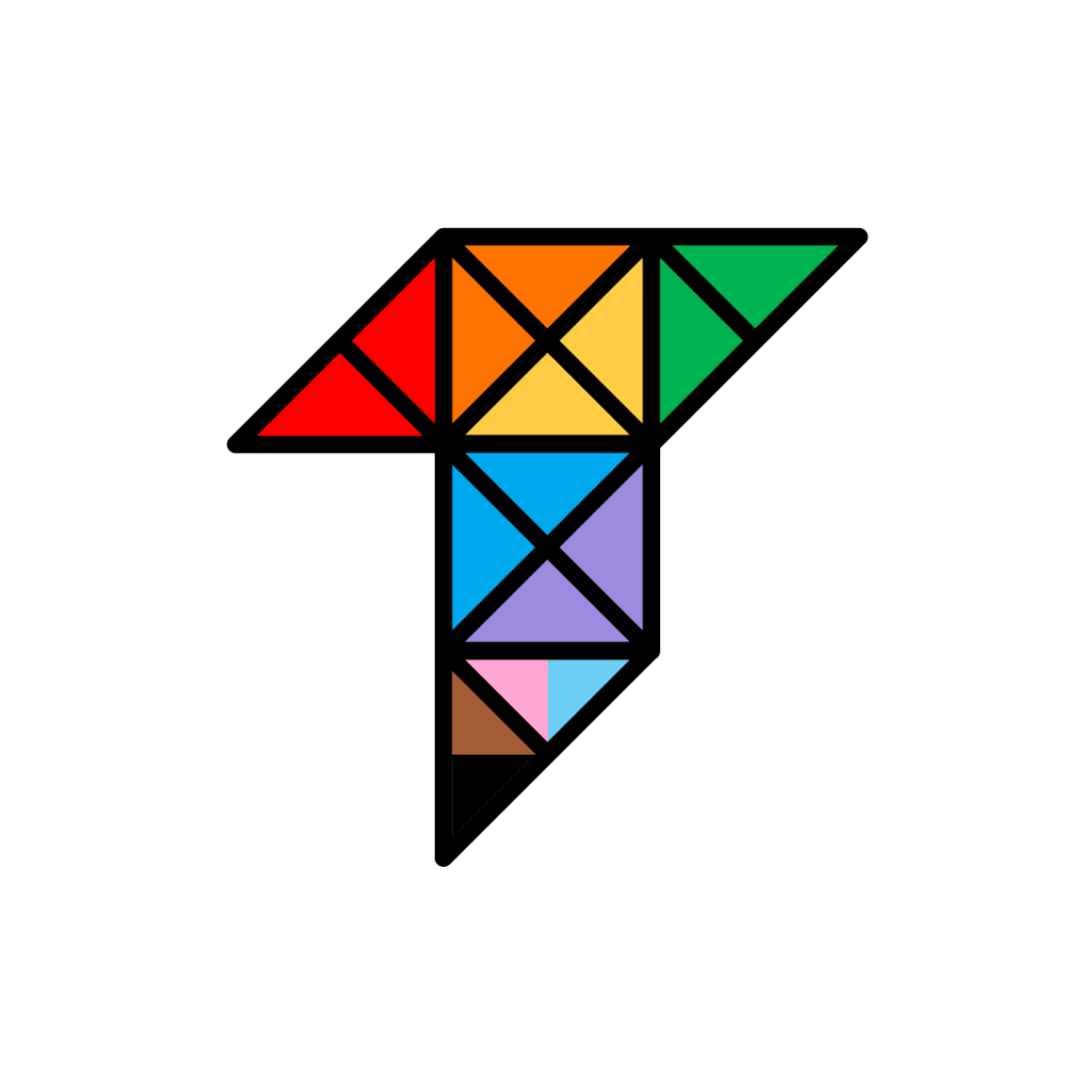
Right on the money.
Just when I thought this was a story about a respected colleague’s effort, professional care, and perseverance to get something just right, Hunter took it to a whole new level for me.
As we discussed how to put this logo into use, and I expressed some hesitation about mere ‘rainbow washing’, Hunter challenged me in the best way. At Tamman, we’ve often discussed not wanting to outwardly ‘virtue signal’ in our company branding or content. That’s not what we want to do. Our organization is run human-first and we live those values every day. Showcasing those values in the form of timely marketing feels performative to us, because we are focusing on them year-round. Showing those colors isn’t something we always feel the need to do just because it’s the ‘month’ for it. Inclusiveness is who we are every day. It isn’t always our space to take a stand. Instead, we use our platform to elevate the voices of those with more lived experience and a specialization in a specific field when they have something to say that isn’t performative, but is insightful and evidence-driven. So we don’t always show this side of ourselves outwardly. To put it another way, our ally-ship for Pride Month didn’t start because our ally-ship never stopped. It’s another constant effort in our culture and community-building efforts.
With that mentioned, here is Hunter’s response.
“I think it is less about rainbow washing and more about showing support for our employees. We have had an employee come out while with Tamman. We currently have several open and out employees, and I think it’s important to express support. And during this month, putting a stance via a rainbow logo happens to be a form of doing so. We aren’t a company that sells merchandise with rainbow items. We are, however, a company that thrives on inclusion and supporting people as people with rights, regardless of race, religion, love, or different abilities.
So anyway, that’s why I took the time to do it. To support my co-workers who are out and proud, and those who aren’t. And to continue Tamman’s well-known supportive structure of all humans.”
– Hunter
Thank you, Hunter. We are now flying our Pride logo in support of our colleagues and all of our allies.
___
Marty Molloy, the President of Tamman, is a passionate leader dedicated to building inclusive teams and fostering a culture of growth. With a background in non-profit leadership and education, he is committed to leveraging technology to create positive impact and make the world more accessible and equitable for all.


