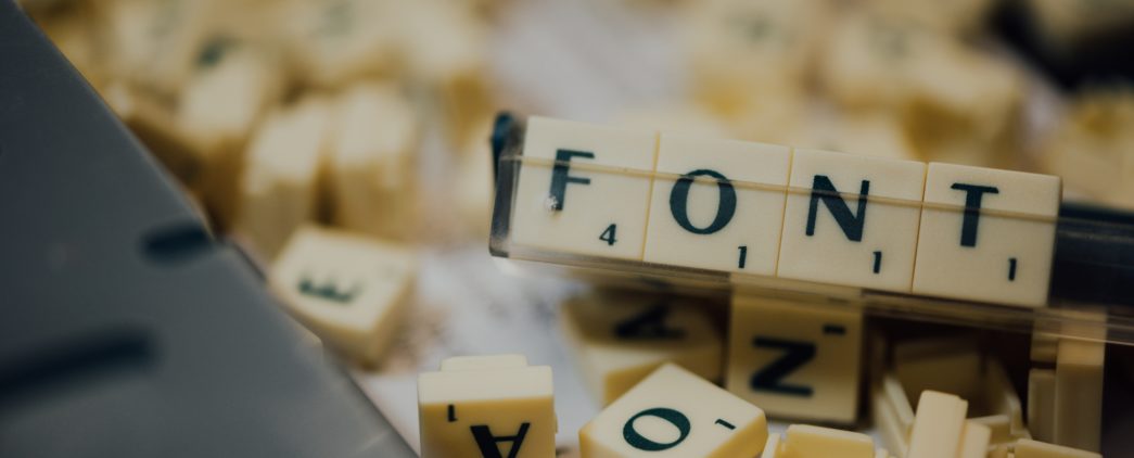
Usability + Accessible = Love (for Verdana)
Why fonts matter for everyone
We hadn’t worked with them for that long, but it was clear they were not happy. The faces said it all. We’d been going around and around with our savvy, and expensive external branding team on fonts for several weeks. This is a conversation worth having as fonts say a great deal about a message and a brand. Yet, we know the designers wanted us to go with something more unique, and perhaps edgier. Ultimately, we disappointed them with our choice; Verdana. Here at Tamman, we can almost hear every other designer reading this thinking, ‘Verdana?!? That boring, spaced-out, digital font born of Microsoft in the mid-1990s? How prosaic!’ Because that was exactly what was on the faces before us now.
We have learned over many years of working with creative people of all stripes that fonts matter. A lot. And we admit that there was a time that we believed fonts do not matter. While there was a time when Tamman dismissed the significance of fonts, prioritizing only readability, experience has led to a change in perspective. Now, we recognize the power of fonts to evoke visceral reactions and reinforce the potency of the written word.
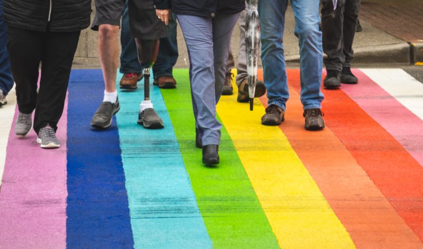
However, for a company like Tamman dedicated to creating a more inclusive web, the story deepens. Accessibility becomes a paramount consideration, transcending the mere reinforcement of textual power. Tamman prioritizes usability, readability, and accessibility as core factors in font selection.
Start a Project
Accessibility Solutions
Empowerment of others and working on the details matter to us. Let us help turn your great idea into something even greater. Take the next step and let’s chat!
Our Calculus
There were many reasons why we chose Verdana as our brand font and all of them touch on some aspect of usability, readability, and/or accessibility – which are not mutually exclusive. In fact, it was precisely the universality and ease of use that pushed us toward Verdana.
Usability
Verdana, whether you like it or not, is an ever-present font found in any document package including Google, Apple, and Microsoft. No one needs to download a special package or convert any of our documents. This is huge. Asking a potential reader to convert the document, possibly losing some of the formatting or the content itself, or downloading some font they’ve never used before would be unacceptable.
All too often, accessibility practitioners get caught up in the minutiae to forget the absolute importance of a good user experience. The fact that Verdana is everywhere and so compatible makes it more accessible. There are other fonts that fit this bill, but this was a very important factor for us.
Readability
This is closely related to kerning of course, but Verdana is a supremely unembellished font that has unique letters and numbers that focus the reader on the text without slowing them down. In one study published by the University of Michigan, Verdana scored extremely well on both the reading speed and the length of fixation for dyslexic readers. Additionally, Verdana was the preferred font of the study participants beating out such fonts as Arial and Times.
Accessibility
Let’s talk spacing (or kerning). Verdana’s kerning has been highlighted by dyslexia experts for its readability. As we all know when something is good for some it’s usually good for all too regardless of a disability. Verdana’s super power is that it keeps its spacing without crowding out or combining letters making it harder to read. And it can do this magically at various sizes!
On Brand
Are people still printing and reading on paper? Just kidding, but Tamman is a digital company building accessible websites and apps. Using a font that was specifically designed in the digital age is on brand for us.
Focusing on the end users, ALL users, in our work is the paramount priority for us. It is irresponsible for us, or any company, not to choose a widely regarded font for accessibility. Having said that, accessible is not synonymous with boring. The trick is finding the creativity within the structures and that is what makes it fun.
At the end of our conversation where we decided on our font, our expensive external branding team was, if not convinced entirely, more on board and excited for that challenge to work with Verdana.
So, what say you, dear reader. Like with so many things in the digital accessibility world, there is room for discussion and debate. We know from hours of research that many articles have been written about fonts and even the strong feelings Verdana provokes and we welcome an ongoing conversation.
Let’s let the great font debate rage on!
Up Next
Thoughts
Months and Anniversaries Are Not Enough