A 5 Step Guide to Accessible Data Visualizations
How simple details can make data visualizations more accessible

As analysts, the reason we spend time creating data visualizations is to communicate information. But what if the information you’re trying to communicate isn’t accessible? By paying attention to a few specific details, you can easily increase the accessibility of your data visualizations and communicate your insights to more people.
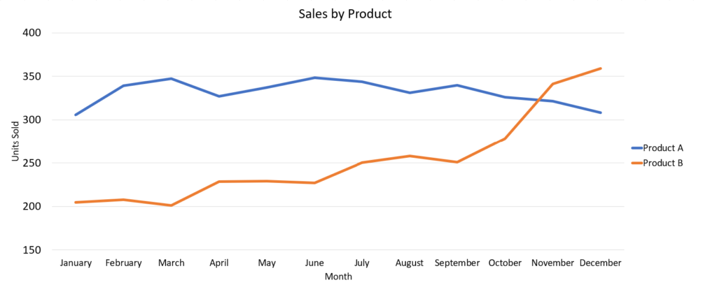
Starting with the default chart below that was generated in Excel, we will make 5 small adjustments, and we will end up with a much more accessible visualization.
Chart 1 – Starting Chart
1. Describe the main takeaway in text
Left-aligned, descriptive, text-based titles and subtitles communicate the most important information found in the visual.
Chart 2 – First Change
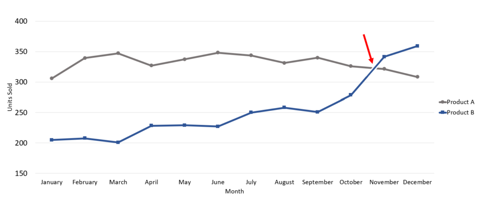
Product B’s performance has overtaken Product A
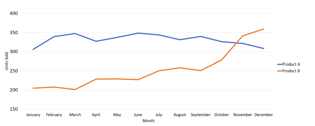
Product B’s sales increased steadily and since November have been higher than Product A, our consistent high-seller.
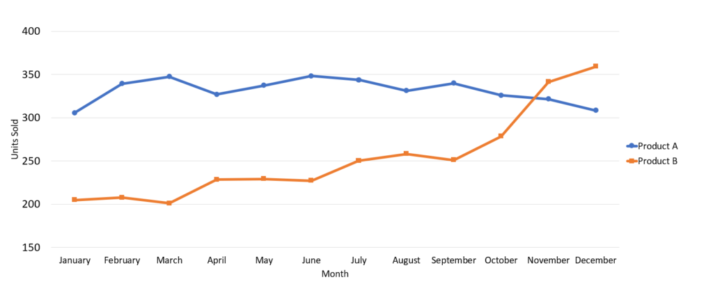
2. Don’t rely solely on color to differentiate data
Use features like fill patterns and icon shapes to differentiate data, instead of only using color. This will make your visualizations understandable to folks with colorblindness – and when it is printed in black and white!
Chart 3 – Second Change
Product B’s performance has overtaken Product A
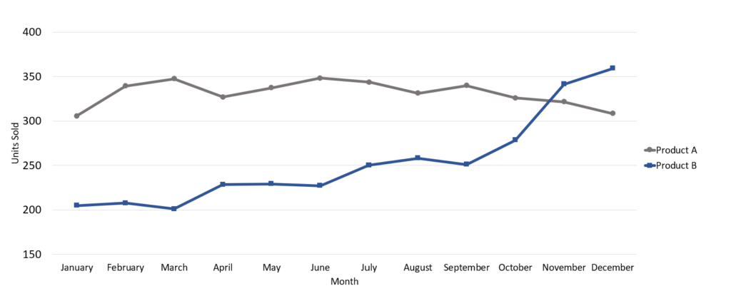
3. Pick your colors intentionally
Choose colors with good contrast to the background, and when in doubt, use fewer colors rather than more. Colors can be used selectively to highlight the information that is important.
Chart 4 – Third Change
Product B’s performance has overtaken Product A
4. Use whitespace to separate elements
Adding whitespace helps folks with low vision separate different data series and can help clarify intersecting lines on a line graph.
Chart 5 – Fourth Change
Product B’s performance has overtaken Product A
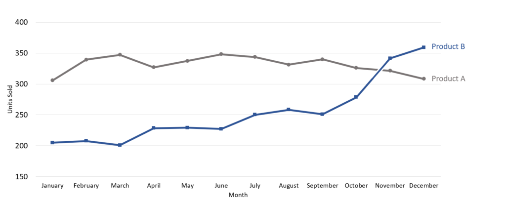
5. Label data series directly
By labeling data series directly, rather than using a key set off to the side, the viewer’s eyes do not have to bounce between two regions on the chart in order to understand which data belongs to which series.
Chart 6 – Ending Chart
Product B’s performance has overtaken Product A
Imagine your data visualizations reaching everyone, not just a select few. By following a few simple design principles, you can make that a reality. Not only will you be doing your job better, but you’ll also be contributing to a more equitable and informed society. It’s time to make your data visualizations more accessible.
Up Next
Podcasts
Data Storytelling