Top 8 Crucial Remediation Mistakes To Avoid
Common issues and practical tips to make your documents inclusive
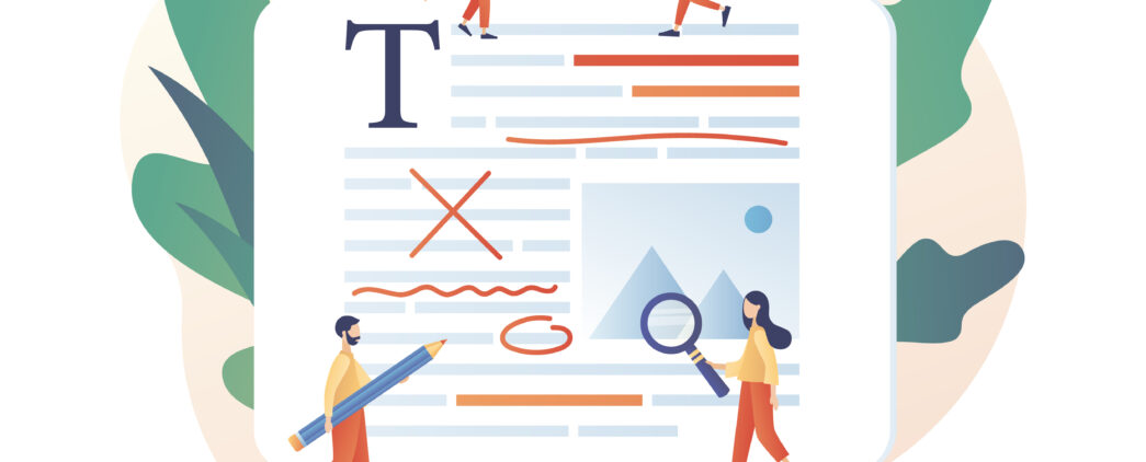
A digital document crash course
Digital accessibility isn’t limited to just websites or apps. It also extends to digital documents, such as PDFs, Microsoft Office files, Google Suite files, and many more types of digital documents. This approach to accessibility feels daunting, and we are here to help by providing a starting point. Here, we are covering 8 of the most common digital document accessibility issues we often experience when remediating (working on a document to make it accessible after it is created) digital documents and other digital assets.
Just as we wouldn’t build a house without considering accessibility for people with disabilities, we shouldn’t create digital content without accessibility in mind. By making your digital documents accessible, you’re ensuring that everyone, regardless of their abilities, can access and use your information.
This may be a mindset shift for you, and we are here to help be your seasoned guide through accessibility by using a common sense approach. Before you know what to do, we’re going to cover common pain points so that you can test your documents for accessibility as frustration-free as possible.
1. Alternative Text
Alternative text (commonly written as “alt text”) is used to describe the important information from an image so a non-sighted user can access that information. All graphical elements need simple and accurate alt text. These elements include images, charts, and graphs. Certain images are mainly decorative and it’s not necessary to use alt text. This is known as “artifacting”. This is a common and key part of making your digital documents accessible.
2. Link Text
Links need appropriate alt text also. Everyone deserves access to information, and if a link is written as a URL, a screen reader will read out each individual character of the URL unless alternative link text is assigned. Vague or unnecessarily descriptive language should be avoided if the link is part of the paragraph copy. The screen reader doesn’t show or read the surrounding copy when navigating directly to the interactive elements. It’s almost as if it isn’t even there.
3. Reading Order
Imagine reading a document and suddenly jumping to a different topic, only to find the conclusion several pages later. This frustrating experience is common for users with visual disabilities when reading documents with an unspecified reading order. This is a common experience for a user with a visual disability and only further illustrates why specifying reading order in documents is essential.
Generally, when the reading order is not specified when creating the document, the elements in that document will often default to the order in which the author created them. This unspecified reading order means accessing the file through a screen reader makes the document difficult to understand and frustrating to use (such as in our example above, which might result from copying and pasting information into your document). Reading order must be manually assigned so a document is read in the intended order in which a sighted user would read it.
4. Color Contrast
All visual elements in a document must have proper color contrast, including infographics, graphics, tables, links, and regular text. People who have low vision or color blindness cannot distinguish information from elements with poor color contrast. This means it is also important to not rely solely on color to convey meaning in a table or infographic. For more information on color contrast, check out our tool to create your own in-house color contrast checker.

5. Document Hierarchy
Often, we design and build documents for those with a visual perspective. We need to be sure that the document easily translates to someone who only has access to auditory information, which includes structuring documents with proper headings. Screen reader users often jump between headings to navigate a document. Therefore, it’s vital to plan out heading levels. It is best to create an accessible structure for your document before applying any visual style. Use tools built into your program to add heading styling rather than manually adjusting the font size, color, etc.
6. Tables
A table should not be used to organize and explain information unless it is being used strictly for tabular data. Tables used for layout purposes should be avoided. The best way to create accessible tables is to include proper table headers to allow for navigation and convey necessary information.
One of our favorite simple steps to start assessing if your table is accessible is trying to navigate through your table using only the tab key. If you can tab smoothly through the table, cell by cell and row by row, a screen reader will likely be able to navigate it and read the data in it.
7. Reading Level
Spelling and grammar are also accessibility potholes. Make sure to proofread your documents. It is important that documents are not overly complex. Consider the reading level of your document. Ensure your writing isn’t too far above your average customer’s. A good rule of thumb is to aim for a 7th – 8th grade reading level. The lower the reading level, the bigger the audience you will reach and retain.
8. Exporting
When exporting a document to a PDF format, exporting it correctly with structure tags is essential. Structure tags are invisible elements that provide additional information about the document’s organization.They help screen readers and other assistive technologies understand the document’s structure and navigate it more effectively. Without these, all the hard work you did may be lost when the document is exported! This includes accessibility features like tags, reading order, and alt text.
Remember, accessibility isn’t about perfection; it’s about making a conscious effort to make your content inclusive. With a little guidance and practice, you can create digital documents that are accessible to everyone.
___
Rose Bliesner is a Document Accessibility Specialist at Tamman and a Certified Professional in Accessibility Core Competencies (CPACC). She works to remediate digital documents, advocates for accessibility, and believes in making the world more accessible one document at a time.
This knowledge sharing blog is one part of a series of content we have produced on digital document remediation. In addition to this blog, we also offer:
- The Importance of Heading Levels and Alt Text – a video of Tamman team members highlighting the importance of accessible PDFs for people with disabilities and how to make them more inclusive
- Introducing Our New Partners, Chax – a podcast episode with the founders of Chax Training and Consulting about mergers, partnerships, and the future of accessible digital documents.
- Different Types of Digital Assets – a blog post describing and explaining the different types of digital documents that should be optimized for digital accessibility
- Transforming Digital Spaces – a podcast detailing our team members’ lived experience of interacting with inaccessible digital documents
- Chax Chat: Our Favorite Accessibility Podcasts – a resource sheet of podcasts we’ve listened to on digital document information from the Chax Chat podcast
- The Essentials of Document Remediation – Tamman’s PDF specialist discusses the importance of accessible PDFs and ensuring they meet high standards for screen reader users